Color Halftone
Get that vintage color comic book or newsprint look with ease. Separate your image into colored ink screens and rebuild it out of dots. Color Halftone renders a separate halftone grid for every channel. Select CMYK or RGB, with each channel at its own screen angle, which is what produces the "rosette pattern" of real four-color printing.
Overview
- CMYK and RGB modes - Subtractive ink on paper, or additive light on black
- Classic print screen angles - Channels are pre-offset (CMYK at 15°/75°/0°/45°) so the default look is a standard print rosette.
- Per-channel Variation controls - Fan the channels apart in frequency, angle or rotation speed for effects no real press could produce
- Round Dots - Crisp circular ink dots for close-up print realism
- Ink Bleed - Soft halo around each dot, simulating ink spreading into paper
- Radial Swirl and Radial Scale - Twist or resize the screen from adjustable center points
- Noise Displacement - Organic, animated distortion of the dot grid
- Contour Displacement - Push the pattern around based on the image's own edges
- Custom Background - Print onto any paper color you like
How this differs from Monochrome Halftone
The two effects are cousins, not duplicates. Monochrome Halftone screens a single luminance channel and gives you pattern shapes — dots, lines, squares, crosshatch, wave modulation, guilloche. Color Halftone always uses dots, but runs a separate screen per color channel with independent angle, frequency and rotation. If you want line art and currency patterns, reach for Monochrome. If you want ink-on-paper color reproduction, reach for this one.
Quick Start
Easiest: Use the Presets!
Apply the effect to your shot, then open the Presets group. There are two dropdowns: Factory Presets and My Presets. Work through the factory presets first — they cover the range of the effect faster than any parameter list will.
So, choose a preset - then play with the parameters to dial it in. Once you have a look you like, type a name into the Save As field and click Save. Your look then appears in the My Presets dropdown.
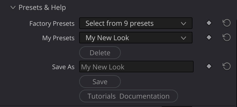
Manual Quick Start
- Apply Color Halftone to your clip. In Resolve you can drag it onto a corrector node on the Color page, or onto a clip on the Edit page; in other hosts, add it as you would any other effect.
- Pick an Output Mode - RGB (default) glows colored light on black. CMYK prints dark ink onto white paper. They look completely different; try both before adjusting anything else.
- Set Frequency to control dot size. Higher numbers mean more, smaller dots. Start around 20-40.
- Round Dots is on by default, for crisp circular ink dots. Turn it off for a softer, smoother dot shape.
- Nudge Angle Variation a few degrees. This fans the channel screens apart and is the single most effective control over how "printed" the result feels.
- Add Ink Bleed (0.2-0.4) for a slightly wet, absorbent-paper feel.
- Explore the warps - Radial Swirl, Noise Displacement and Contour Displacement all distort the dot grid while leaving the image itself in place.
Inputs
| Input | Required | Description |
|---|---|---|
| Source | Yes | The image to screen into halftone dots |
What happens to the source alpha depends on the Alpha Output setting (see the Output group): by default it passes through unchanged.
Parameters
Output
How the separated inks are recombined into a picture.
| Parameter | Type | Default | Range | Description |
|---|---|---|---|---|
| Output Mode | choice | RGB | RGB, CMYK | Additive light (RGB) or subtractive ink (CMYK) |
| Round Dots | bool | true | - | Crisp circular dots; off = softer, smoother dot shape |
| Custom Background | bool | false | - | Off = automatic paper color |
| Background Color | color | black | - | Paper/backing color, used only when Custom Background is on |
| Alpha Output | choice | Source | Source, Ink Coverage | What the output alpha channel carries |
Output Mode
- CMYK - Four screens (cyan, magenta, yellow, black) laid over white. Each ink subtracts its complementary color, exactly as ink on paper does. This is the mode for print, newsprint and comic looks.
- RGB - Three screens (red, green, blue) added onto black. This is how a display or projector builds an image, and it gives a vivid, glowing, pop-art result rather than a printed one.
Custom Background
With Custom Background off, the backing is chosen for you: white for CMYK, black for RGB. Turn it on to print onto tinted stock — warm cream for aged newsprint, or a saturated color in RGB mode for a screen-printed poster look.
Round Dots
Two different dot-shape models are available:
- On (default) - Dots are perfect hard-edged circles, matching what you see under a loupe on a printed page. Each dot is colored by a single sample taken at its own cell center, so under strong Swirl, Radial Scale, Noise or Contour Displacement the image itself gets dragged along with the grid.
- Off - Dots are built from a smooth cosine grid. Shapes are slightly softer and more oval, and the underlying image stays locked to the frame no matter how heavily you warp the pattern.
Alpha Output
Controls what the output alpha channel carries.
- Source (default) - The input alpha passes through untouched. The effect behaves like any other filter. Note that the halftone itself is applied to the whole frame — the incoming matte does not limit where dots are drawn, it just rides along in the alpha (see Troubleshooting if that surprises you on keyed footage).
- Ink Coverage - Only the dots are opaque. The alpha channel becomes the ink coverage itself, and the paper is removed from the picture (the output is premultiplied), so you can lay the halftone directly over other footage — the dots float, the paper vanishes. Works in both RGB and CMYK modes, and any incoming matte still applies: with Round Dots on, dots at the matte edge survive or vanish as whole dots; with Round Dots off, dots are clipped cleanly at the edge.
Halftone Settings
The core screen: how fine it is, which way it runs, and how the channels differ from one another.
| Parameter | Type | Default | Range | Description |
|---|---|---|---|---|
| Frequency | float | 35.84 | 1.0 - 50.0 | Cells across the image (higher = more, smaller dots) |
| Frequency Variation | float | 0.0 | -0.5 to 0.5 | Per-channel frequency offset (±0.5 = ±50%) |
| Angle | float | 0.0 | -180.0 to 180.0 | Global rotation of all screens, in degrees |
| Angle Variation | float | 0.0 | -30.0 to 30.0 | Extra per-channel angle spread, in degrees |
| Rotation Speed | float | 0.0 | -50.0 to 50.0 | Continuous rotation of all screens (degrees per second) |
| Rotation Speed Variation | float | 0.0 | -90.0 to 90.0 | Per-channel rotation rate offset |
| Edge Softness | float | 0.1 | 0.1 - 5.0 | Sub-pixel anti-aliasing on dot edges |
| Ink Bleed | float | 0.0 | 0.0 - 1.0 | Soft halo around dot edges |
Frequency, Angle, Rotation Speed and Noise Amount accept values beyond their slider ranges if you type them in — several of the factory presets do exactly that.
Screen Angles and the Variation Controls
This is the heart of the effect, and the one thing that has no equivalent in Monochrome Halftone.
Every channel already carries a built-in print angle, applied on top of whatever you set in Angle:
| Mode | Channel angles |
|---|---|
| CMYK | Cyan 15°, Magenta 75°, Yellow 0°, Black 45° |
| RGB | Red 15°, Green 45°, Blue 0° |
Those offsets are the reason four overlapping screens read as a rosette instead of an ugly moiré, and they are why the effect looks correct at default settings. Angle rotates the whole set together and preserves the relationship.
The three Variation controls fan the channels further apart, symmetrically around the global value, so the average stays where you set it:
- Angle Variation widens or narrows the spread between screens. Small values (5-15°) read as a different press setup; large values break the rosette into visible interference patterns.
- Frequency Variation makes some inks coarser and others finer. At ±0.5 the extreme channels differ by 50% from the global Frequency. Nothing physical works this way, which is precisely why it is useful.
- Rotation Speed Variation gives the channels different rotation rates — with a large enough value, opposite directions — so the colors continuously drift through each other.
Frequency
Frequency counts cells, so it runs the intuitive way — bigger number, smaller dots:
- 1-10: Enormous dots, a handful across the frame; abstract and graphic
- 10-25: Bold pop-art dots, individual cells clearly readable
- 25-50: Newspaper and comic-book range
- 50-120: Fine magazine screen; the rosette becomes the visible texture
- 120+: Approaches continuous tone, with the color separation showing only as fine grain
Ink Bleed
Ink Bleed widens each dot with a soft outer halo rather than a hard edge, the way ink wicks into uncoated paper. Low values (0.1-0.3) add believable print softness; high values thicken the inks until the darker areas fill in and clog, which is a good and characterful newsprint failure.
Edge Softness is a different control — it only anti-aliases the dot boundary at sub-pixel scale. Raise it if fine dots shimmer or crawl; leave it low for maximum crispness.
Input Levels
Adjust the image before it is separated into inks.
| Parameter | Type | Default | Range | Description |
|---|---|---|---|---|
| Gamma | float | 0.77 | 0.5 - 4.0 | Midtone adjustment (higher = brighter midtones) |
| Lift | float | 0.0 | -0.2 to 0.2 | Value added to output (raises shadows) |
| Gain | float | 1.0 | 0.5 - 2.0 | Multiplier for output brightness |
| White Point | float | 0.998 | 0.5 - 1.0 | Input values at/above this map to white |
| Black Point | float | 0.0 | 0.0 - 0.5 | Input values at/below this map to black |
These controls set how much ink lands on the page. Because the separation happens after them, they behave like press density controls: raising Gain thins the ink and opens up the highlights, while lowering White Point drives more coverage into every channel and saturates the result. There are no rules here — push them until the dot structure reads well on your shot.
Radial Swirl
Twist the dot grid around a center point.
| Parameter | Type | Default | Range | Description |
|---|---|---|---|---|
| Swirl Amount | float | 0.0 | -360.0 to 360.0 | Angular twist added as distance from center increases |
| Swirl Center | vec2 | 0.0, 0.0 | - | Center point for swirl (cyan crosshair overlay) |
| Swirl Falloff | float | 1.0 | 0.1 - 4.0 | Exponent controlling how the twist builds with distance |
- Positive values: Clockwise twist
- Negative values: Counter-clockwise twist
- Falloff < 1.0: Most of the twist happens near the center
- Falloff > 1.0: Most of the twist happens toward the edges
- Falloff = 1.0: Linear increase with distance
Radial Scale
Change dot size with distance from a center point.
| Parameter | Type | Default | Range | Description |
|---|---|---|---|---|
| Radial Scale | float | 0.0 | -3.0 to 3.0 | Frequency multiplier added as distance from center increases |
| Radial Center | vec2 | 0.0, 0.0 | - | Center point for scale (orange crosshair overlay) |
| Radial Falloff | float | 1.0 | 0.1 - 4.0 | Exponent controlling how the scaling builds with distance |
Note that this control is far more sensitive than the equivalent in Monochrome Halftone — its useful range is roughly -3 to 3, not hundreds. Values of 0.2-0.5 are already a strong effect.
- Positive values: Smaller dots toward the edges, focusing attention on the center
- Negative values: Larger dots toward the edges
- Setting different centers for Swirl and Scale produces asymmetric, lens-like distortions
Noise Displacement
Push the dot grid around with animated procedural noise, for a hand-printed or misregistered feel.
| Parameter | Type | Default | Range | Description |
|---|---|---|---|---|
| Enable | bool | false | - | Enable noise displacement |
| Amount | float | 0.25 | -2.0 to 2.0 | Strength of displacement, in pattern cells |
| Scale | float | 25.0 | 1.0 - 60.0 | Size of the noise features (higher = broader swells) |
| Animate | bool | true | - | Enable time-based evolution |
| Speed | float | 0.5 | -2.0 to 2.0 | Animation speed |
Contour Displacement
Shift the dot grid based on edges found in the image itself, so the screen appears to flow around the subject.
| Parameter | Type | Default | Range | Description |
|---|---|---|---|---|
| Enable | bool | false | - | Enable contour-based displacement |
| Softness | float | 20.0 | 0.0 - 100.0 | Blur amount used for contour detection |
| Displacement | float | 0.0 | -40.0 to 40.0 | Displacement strength, in pattern cells |
| Displacement Angle | float | 0.0 | -1.0 to 1.0 | 0 = across edges, ±1 = along edges |
- Softness sets the scale of the features the effect responds to. Low values catch fine detail and texture; high values respond only to the broad shapes in the frame.
- Displacement Angle = 0 pushes dots perpendicular to edges, so the grid appears to pile up against contours.
- Displacement Angle = ±1 slides dots along edges, making the screen appear to flow around the subject.
Unlike Monochrome Halftone, there is no contour-driven scale control here — in a multi-channel screen, changing cell size per region breaks the registration between inks. Displacement is the control that survives the extra channels.
Presets
| Preset | Description |
|---|---|
| 01 Basic CMYK Dots | The clean reference CMYK screen with classic soft dots |
| 02 Dots with Swirl | Rotating CMYK screen with a moderate radial twist |
| 03 Dots with Swirl and Animated Noise | The same, loosened up with animated noise displacement |
| 04 Contoured Dots 1 | Fine screen flowing gently around image contours |
| 05 Contoured Dots 2 | Heavy, soft contour displacement with added noise |
| 06 Contoured Dots 3 | Contour flow biased along edges rather than across them |
| 07 Contoured Dots 4 | Extremely coarse cells driven almost entirely by contours |
| 08 Contoured Dots 5 | Coarse cells with fine-scale noise breakup |
| 09 Freaky Face | Maximum contour displacement over a huge rotating cell — heavily abstracted |
| 10 Newspaper CMYK | Tight screen with a 15° channel spread; classic newsprint |
| 11 Rosette Pattern | RGB round dots at high frequency — the print rosette, close up |
| 12 RGB Pop Art | Glowing RGB screens counter-rotating against each other |
| 14 Frequency Asymmetry | Channels deliberately screened at different frequencies |
Tips & Tricks
Newsprint
- Output Mode to CMYK
- Frequency around 40
- Angle Variation to 15
- Ink Bleed at 0.2-0.3 to thicken the inks
- Enable Custom Background and pick a slightly warm off-white for aged paper
- Start from preset "10 Newspaper CMYK"
Comic Book / Pop Art
- Output Mode to RGB, Round Dots on
- Frequency in the 15-25 range so individual dots read clearly
- Raise Gain to open up the highlights and let the paper show through
- Optionally set Custom Background to a saturated color for a screen-printed poster feel
- Start from preset "12 RGB Pop Art"
Close-Up Print Rosette
- Round Dots on
- Frequency 80-120
- Angle Variation around 30
- Keep Edge Softness low (0.1-0.5) so the dot edges stay hard
- Start from preset "11 Rosette Pattern"
Misregistered Press
- Frequency Variation at 0.2-0.4 so the inks no longer share a grid
- Angle Variation around 20-25
- A little Ink Bleed to soften the collisions
- Start from preset "14 Frequency Asymmetry"
Animated Color Drift
- Set Rotation Speed to a small value (2-5 degrees per second)
- Add Rotation Speed Variation of 15-30 so the channels separate over time
- Enable Noise Displacement with Animate on for continuous movement
- Keep Round Dots off — the picture stays locked in place while the screens move
Floating Dots Over Other Footage
- Set Alpha Output to Ink Coverage
- Lay the result over any background with a Merge/composite — the paper disappears and only the dots remain
- The dot colors keep their ink behavior, including CMYK overlap colors
- For a poster feel, put a flat color layer underneath instead of footage
Screen That Follows the Subject
- Enable Contour Displacement
- Set Softness to 40-60 so it tracks broad shapes rather than texture
- Raise Displacement to 10-30
- Set Displacement Angle near ±1 to make the dots flow along contours instead of piling against them
Troubleshooting
Output looks washed out or nearly white
- In CMYK mode the background is white paper; a bright source lays down very little ink. Lower White Point or Gain to increase coverage.
- Check that Frequency is not so high that dots are sub-pixel.
Output is dark and muddy
- In RGB mode the background is black, so a dark source produces almost no light. Raise Gain or Lift.
- In CMYK, high Ink Bleed will fill in and clog shadow areas — reduce it.
No visible dots, just a soft version of the picture
- Frequency is too high for the render resolution. Lower it, or check whether you are viewing a proxy/downscaled preview.
- Raise Frequency deliberately past 120 only when you want continuous tone.
The image itself distorts when I use Swirl or Noise
- This is expected with Round Dots on: each dot samples the picture at its own warped cell position, so the picture travels with the grid. Turn Round Dots off to keep the image locked to the frame while the pattern warps.
Dots shimmer or crawl during playback
- Raise Edge Softness toward 1.5-3.0 for stronger anti-aliasing.
- Lower Frequency — very fine screens alias badly in motion regardless of settings.
Dots appear outside my matte (Source mode, CMYK)
In Source mode the halftone is matte-blind: it screens the whole frame and simply passes the incoming alpha through. On keyed footage the area outside the matte is black — and in CMYK, black means maximum ink on white paper, so that region fills with heavy dots sitting at zero alpha. (In RGB mode the same thing happens, but black means no light, so the region renders as nothing and you never notice.)
Two clean ways to handle it:
- Switch Alpha Output to Ink Coverage — the paper is removed and the matte gates the dots properly. This is the intended mode for keyed input.
- Or keep Source mode and crop the excess downstream: in Fusion, a Merge over black with the Subtractive/Additive slider set to full Subtractive multiplies the image by its alpha first, which makes the outer dots go away as you'd expect.
Image went transparent / background vanished
- Alpha Output is set to Ink Coverage — that mode removes the paper on purpose so the dots can composite over something else. Set it back to Source for normal filter behavior.
Dots look sliced off at the edge of my matte
- With Round Dots off, dots are clipped cleanly at the matte edge in Ink Coverage mode. Turn Round Dots on to have edge dots survive or vanish as whole dots instead.
Channels look stacked rather than rosetted
- Angle Variation may be cancelling the built-in print angles. Return it to 0 to get the standard CMYK 15°/75°/0°/45° relationship back.
Swirl or Scale center is not responding
- The center points have on-screen crosshair overlays: cyan for Swirl, orange for Radial Scale. Make sure your host's on-screen controls are turned on — in Resolve, enable OpenFX Overlays from the dropdown at the lower left of the viewer.
- Check that Swirl Amount or Radial Scale is not still at zero; the center has no effect until the amount is non-zero.
Contours are not affecting the pattern
- Confirm Enable is checked in the Contour Displacement group.
- Raise Displacement — small values are subtle at typical frequencies.
- Adjust Softness; very high values blur away the features you are trying to follow.
Animation is not moving
- Check that Rotation Speed, Rotation Speed Variation or Noise Speed is non-zero.
- Animate must be enabled in the Noise Displacement group for the noise to evolve.
- The effect is driven by timeline time, so it will only move during playback or as you scrub.
Extra Inputs, Mattes & Alpha
Applies to AVFX effects updated August 2026 or later - you'll know your build has it if you see the "Alpha/Matte" parameter group.
This section is shared by the documentation of every AVFX effect - the information here is general, not specific to this effect.
The short version
The AVFX effects framework supports any number of extra inputs in addition to the clip the effect is applied to - for example: a blur map, a custom bokeh shape, an external matte, and so on. In most hosts, each one simply gets its own connection: After Effects and Premiere Pro give every input its own layer selector in the Effect Controls, and in Fusion (and other node-based hosts) each node gets a "port" for each input, as you'd expect.
Alpha is the fourth channel of the image itself - the "A" in RGBA - used for compositing downstream of the effect. It rides along with the RGB through the processing, and embedded alpha behaves just as you'd expect: if your source clip already carries an alpha channel, nothing special is needed.
The one ability AVFX adds everywhere: your input alpha can come from the source's embedded alpha, or from an external matte injected in its place. A matte is any grayscale or RGB clip - its brightness becomes the alpha (the matte clip's own alpha channel is ignored, so it doesn't need one). Unlike other extra inputs, which steer how the effect processes the image, the Matte input feeds this alpha. From there it rides through the processing along with the source's RGB, just like embedded alpha would, and what emerges is the output's alpha - consistent with the processed image, because it went through the same processing.
The Alpha Source selector (in the Alpha/Matte group) chooses where the input alpha comes from: Auto (the effect picks sensibly), Source's Embedded Alpha, Matte Input's Luminance (called Matte Layer's Luminance in After Effects and Premiere), or Opaque (Alpha = 1) - the escape hatch when you just want a solid frame.
Premultiply Output depends on what the effect hands you, so there is no single right setting:
- Turn it ON when the output is a processed picture carrying a matte in its alpha - the usual case when you feed a Matte input. Without it, Resolve's timeline composite leaves bright fringes or sparkle along the matte edges.
- Leave it OFF when the output is an element on black, such as Optics Reborn's "/ Alpha" glow modes. Those already have their coverage baked into the color, so switching it on multiplies it in a second time and gives you a dark edge instead.
Rule of thumb: ON if the frame still looks like your shot, OFF if it looks like a glow floating on black.
One host is different: Resolve's color page handles inputs and alpha in its own way, and is described in the next section. If you don't use the color page, skip straight to your host's section below.
Resolve color page
A color-page node accepts at most two connections. The first is always the main image being processed - so every extra input the effect can accept has to share the second connection, and that second input can only serve one function at a time. This is a limitation of Resolve's color page.
That's what the "Resolve Color Page: Input 2 Routing" group is for: choosing which of the effect's extra inputs the second connection serves - a map that steers the processing, or the Matte that feeds the alpha. Take Advanced Lens Blur: there are three possible uses for its second input - the Kernel (an image used as the bokeh shape), the Blur Map (brightness controls blur strength per pixel), or the Matte Input (external alpha for compositing). You can only use one of these at a time, and the "Use Input 2 As" selector is how you choose: connect your clip to the node's second green input, then set the selector to the input it should feed. (The Matte Input is always one of the choices - the framework provides it on every effect. If an effect has no other extra inputs, there's no selector at all: the second input simply is the Matte.)
If you need two of them at once - say, an external matte and a custom kernel - you'll have to use the Fusion page (or another host), where all of the inputs are available simultaneously.
Don't rely on embedded alpha on the color page - its results there are unpredictable (the color page does some things under the hood that are out of reach of the OFX plugin). Feed a matte through Input 2 instead (Use Input 2 As → Matte Input).
Compositing: in Resolve, the color page and the timeline share the job: the actual comp happens on the timeline - your clip sits on a video track above whatever it composites over - while the color page is where the alpha is produced. The timeline only sees that alpha if you explicitly export it from the node graph: right-click in the color page's node area, choose Add Alpha Output, and connect your node's blue alpha output to it. The effect's node already carries the alpha - "OFX Alpha" is enabled by default - but you should also right-click the node and deselect "Use OFX Alpha for Mixing": that setting turns the alpha into a mix mask between the node's input and output instead of compositing coverage, which is almost never what you want.
Resolve/Color Page Troubleshooting:
- Bright fringes or "sparkle" at matte edges during playback - turn ON Premultiply Output. If you followed the Compositing steps above, "Use OFX Alpha for Mixing" is already off, so that is not the switch that helps here - Premultiply is. (Stills can look clean while motion sparkles: playback renders at reduced resolution, which creates the fractional alpha that exposes the mismatch.)
- The composite looks like a blend of the clean and processed image at the edges - same cause: "Use OFX Alpha for Mixing" is ON. Turn it off. (If the whole frame looks blended with the source, that's a different knob - check that Global Blend is set correctly.)
After Effects & Premiere Pro
Each of the effect's inputs has its own layer selector in the Effect Controls - pick any layer in your comp (or Premiere sequence) for each one. It's best to precompose vector layers (shapes, text) before using them as inputs.
Compositing: for glow or element outputs, set the layer blend mode to Luminescent Premul - the Normal mode attenuates premultiplied elements twice and leaves a subtle dark edge. Keep Blend at 1 when compositing with the effect's alpha (Blend mixes the untouched source back in, alpha included) - fade with layer opacity downstream instead.
AE Troubleshooting:
- Dark edge on glows - the layer blend mode is Normal; switch to Luminescent Premul. If it's darker still, Premultiply Output is ON; turn it off.
Fusion & everywhere else
Fusion (and Resolve's Fusion page) gives the node a connection per input, and compositing needs no special setup: the effect's output carries its alpha embedded, just as you'd expect, so wire it into an ordinary Merge node and leave its settings at their defaults.
General Troubleshooting:
- If the same comp looks different in different hosts - the math is identical in every host, but the color transforms might not be. Make sure you're evaluating everything through the same color pipeline. (In Resolve, that means pinning the project's Timeline and Output color space to your delivery standard before comparing.)